PRINT: Go Ahead catalog refresh - Tour pages
The Go Ahead tour content refresh was a massive project that touched a multiple versions of itineraries across both print and web. With a portfolio of around 150 tours that is constantly growing and changing, content must be easily adaptable and editable across all mediums. Clarity was key—the previous catalog had met with feedback from the sales and service teams that customers were consistently calling with questions about what was included in their tour and what was a suggested activity.
Creative Director: Bryant Ross // Designers: Christine Patronick, Steph Schlim // Additional concepting & copywriting: Courtney Taddonio, Laura Barber
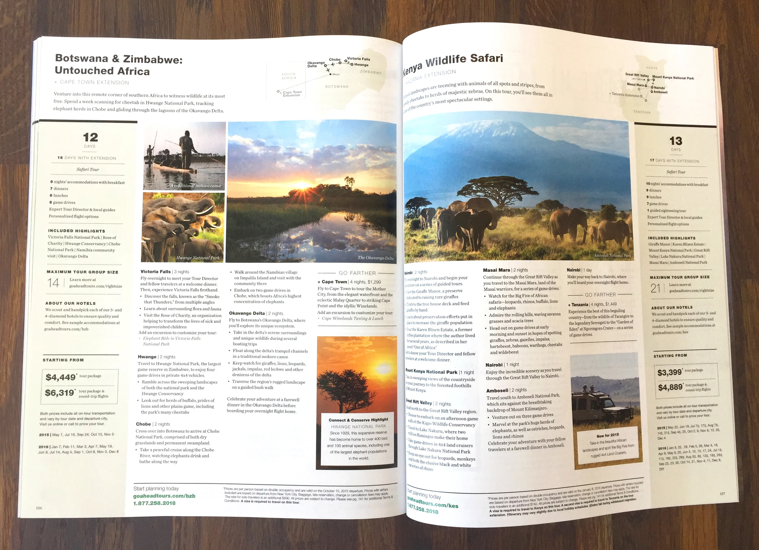
Full tour page spread (click to enlarge)
The bulleted itineraries are easier to scan than dense paragraphs and give a sense of how many activities are included in each stop on the tour. We removed loads of flowery language that had previously been used to fill space and created a more modular copy system that was easier to both read and edit. For example, as travelers will experience the same sightseeing tour of Paris on the "London, Paris & Rome" tour as they will on the "Paris, Provence & the French Riviera" tour, the Paris section of those particular itineraries are identical.
Editorial module detail (click to enlarge)
Since we were no longer writing the itineraries to fill space, we created editorial modules to fill in some of the blanks. Tour highlights, special events, fun facts and updates complement the information presented on the page while still remaining separate from the itinerary.
Side bar detail (click to enlarge)
An editorial introduction sits under the tour title on each page to give readers a feel for the tour's personality. The side bar shows a snapshot of what is included, with pricing that is prominent but not overpowering.